Forty Summers of Heat
Mapping Hungary's Surface Temperature from Space
Every August I can remember, the same conversation happens in Budapest: it never used to be this hot. It is a claim that feels obviously true and is not so straightforward to check. Weather stations are few and far between, they measure air in the shade, and they say nothing about why the unbearable heat on the roads and walkways.
Lucky for us - geospatial intelligence, and satellites can answer a version of that question — not the one about air, but the one about surfaces. NASA and the USGS have been photographing the whole world, including Hungary, in thermal infrared since 1984, and the whole archive is free. In this article, I turn four decades of Landsat scenes into one map per summer for three very different Hungarian places: Budapest, the town of Paks with its nuclear power plant, and Lake Velence. The latter two locations are currently undergoing serious climate risk hazards - making this mapping more then timely.
Then I put all of it into a single interactive map you can scrub through year by year. That is the map at the top of this page — the live version, where the sliders actually work, is here.
For full Python tutorial, click here, and for the quick YouTube walk-through, click here.
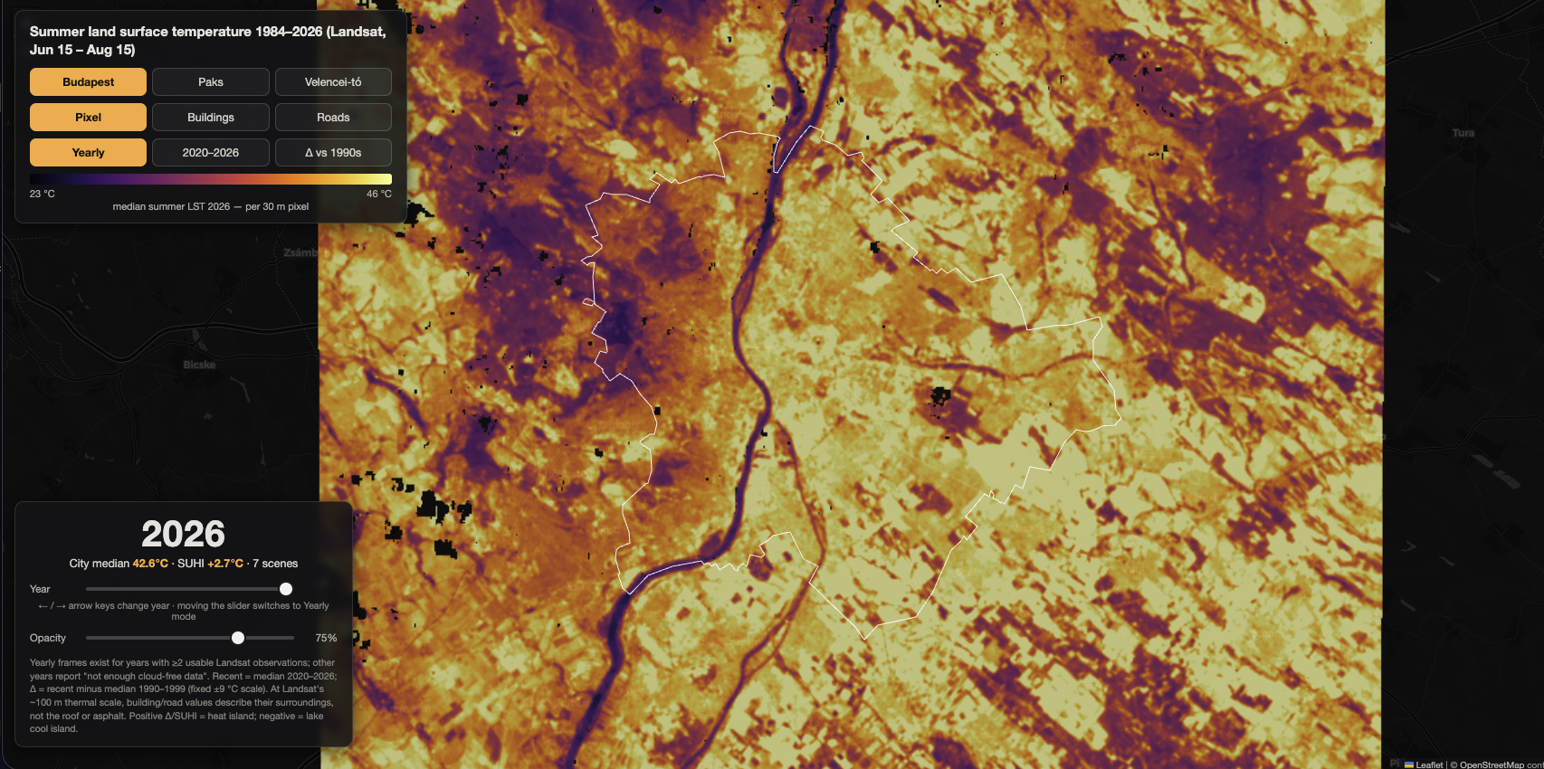
Figure 1. Screenshot of the interactive map viewer.
What a thermal satellite actually measures
Think of the difference between the air around you and the surface you touch. On a sunny day a car bonnet, an asphalt road, or a beach can be painfully hot — 50 or 60 °C — while the air is a comfortable 30 °C. Land Surface Temperature (LST) is the temperature of that skin of the Earth: the top of the pavement, the roof, the grass, the tree canopy, measured by satellites reading the infrared radiation surfaces give off.
It is emphatically not "the temperature outside." Air temperature is measured in the shade, 1.5–2 metres up, inside a ventilated screen. LST is the sunbaked surface itself. It tells you how hot things are to the touch, not how hot the air feels to breathe. A frying pan can read 200 °C while the kitchen air is 22 °C — both are temperatures, and they mean completely different things.
This is exactly why the "Europe hits 60 °C" maps that circulate every heatwave are so misleading. On 11 July 2023, Copernicus measured land surface temperatures above 60 °C in Extremadura, Spain — while the actual air temperature that day was roughly 38–43 °C. Both numbers are real. Only one of them is what a thermometer on your balcony would show.
Keep that distinction in mind for everything below. Every number in this article is a surface temperature.
The data: forty-two years of free thermal imagery
As in most of my projects, the first question was what to build on. Here the answer was easy: the Landsat Collection 2 Level-2 Surface Temperature product, which covers Landsat 4, 5, 7, 8 and 9 — an essentially unbroken thermal record from 1984 to today, at 30 metres per pixel, free of charge.
Getting to the pixels used to be the painful part. It is not anymore. The whole archive is queryable through STAC, a standard catalogue API, and served by the Microsoft Planetary Computer without an account, an API key, or a download manager (more on the technical details in my recent course). Two lines of Python open the catalogue and ask a question like "every Tier-1 scene touching this box between 15 June and 15 August," and you get back a list of scenes with their cloud cover and footprints before downloading a single pixel.
I settled on a mid-June-to-mid-August window rather than July alone. That one choice roughly doubled the usable scene count, which turned out to be the difference between a patchy series and a complete one — Budapest went from 24 mappable years to 38.
From cloudy snapshots to one clean map
A satellite does not hand you a heat map. It hands you a few dozen snapshots per summer, most of them partly covered by cloud — and cloud is the whole problem, because cloud is cold. Leave one in and it burns a fake cool spot into the map, exactly where the sky happened to be busy that morning.
The fix is not clever, it is patient. Every Landsat scene arrives with quality flags marking which pixels are cloud, shadow or haze, and those go straight in the bin. What is left is a summer's worth of Swiss cheese: each date clean in some places and blank in others.
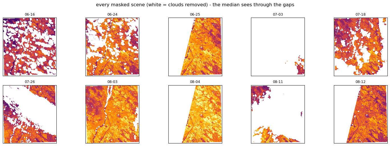
Figure 2. Every usable scene of a single Budapest summer, after the clouds have been cut out. White is what the weather took.
And that is exactly what makes it work, because the holes move. Cloud sat over one neighborhood on one date and over another one two weeks later. So I stack every scene of the summer and, for each 30-metre pixel, take the middle value of all the clear looks it got — the median. And in case of the less frequent, smaller, more localized data errors, the holes fill in with real measurements from other days, and what survives is the shape of the summer rather than the weather of one particular morning.
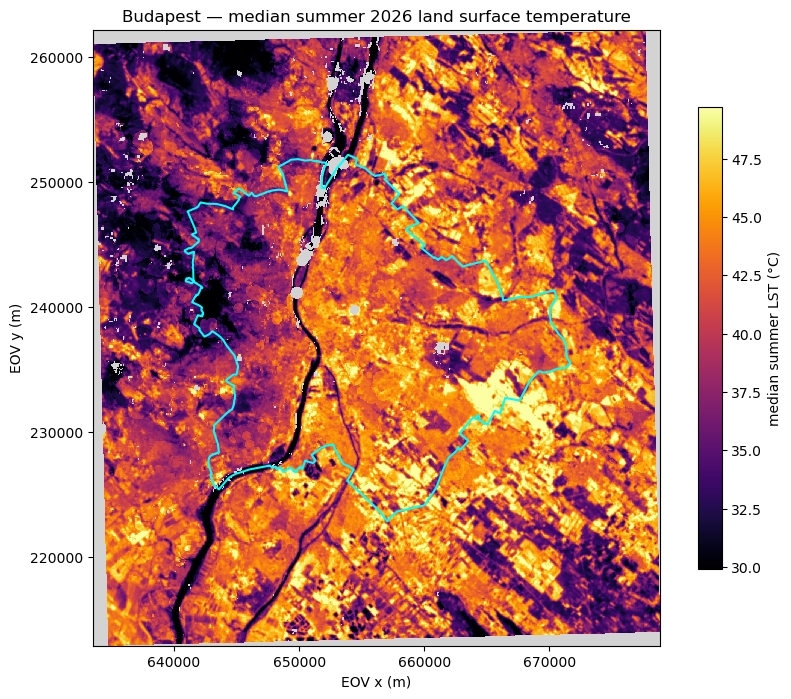
Figure 3 The result: median summer surface temperature for Budapest in a single year. The Danube and the Buda hills read cool, Pest's dense core and the industrial belt read hot.
As a result of this process, we ended up having one map per summer, per place (Budapest / Paks / Velence). I also keep a companion map counting how many clear looks stand behind each pixel, because a "median" of one observation is not a median — it is a single cloudy morning wearing a disguise.
If you want the full version — every step, every check, and the plots that catch the mistakes before they reach the map — that is what the accompanying Python notebook is for - you will find the it on Substack.
Forty summers at once
With one summer working, the rest is bookkeeping — 451 scenes for Budapest alone, each downloaded, masked, reprojected once, and composited per year. The result is a small-multiples grid on a single shared colour scale, which is the only way year-to-year comparison means anything.
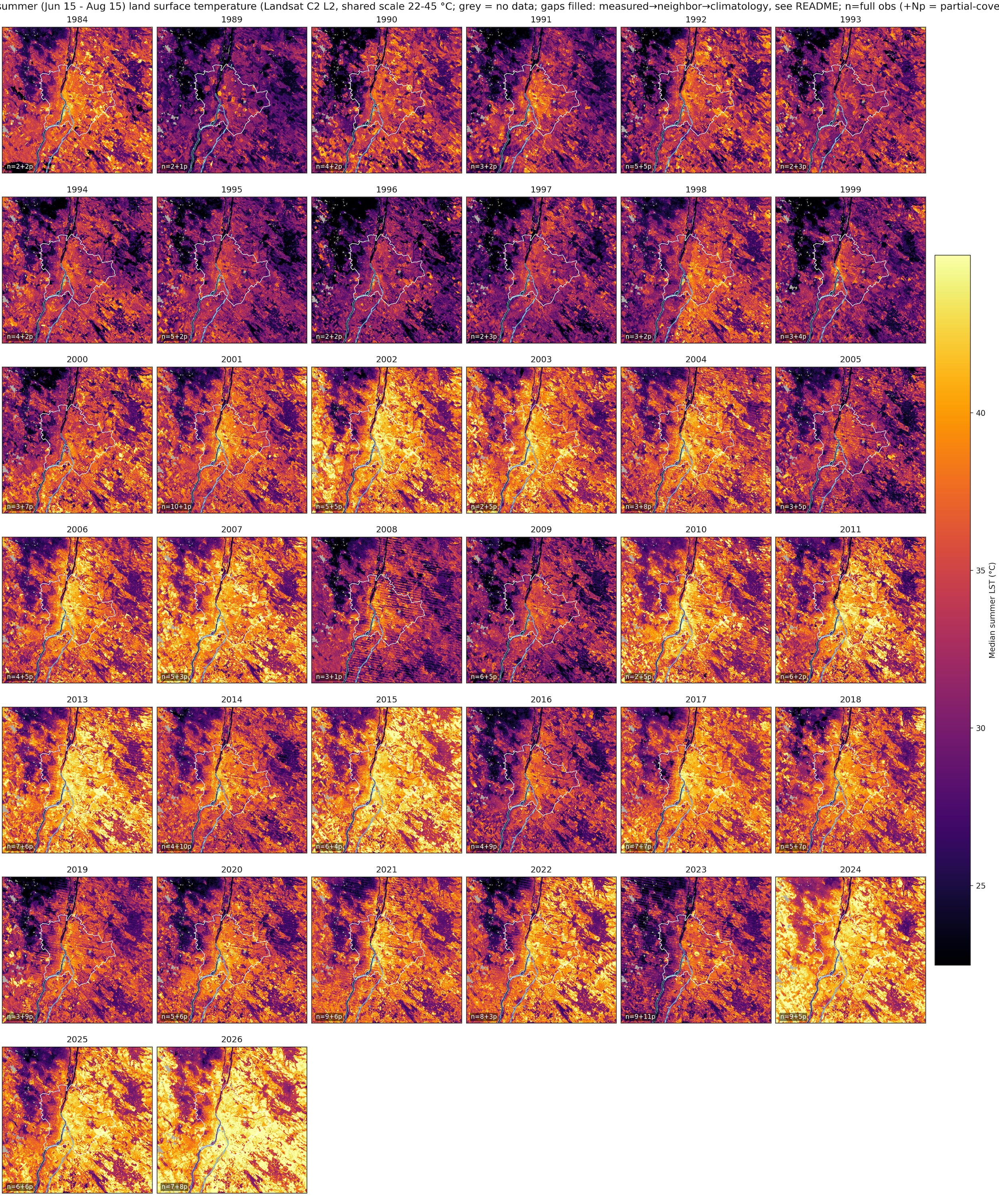
Figure 4a. Median summer land surface temperature of Budapest, 1984–2026, 38 mappable years on one fixed 22–45 °C scale. Grey means no usable data. The label in each panel counts the observations behind it.
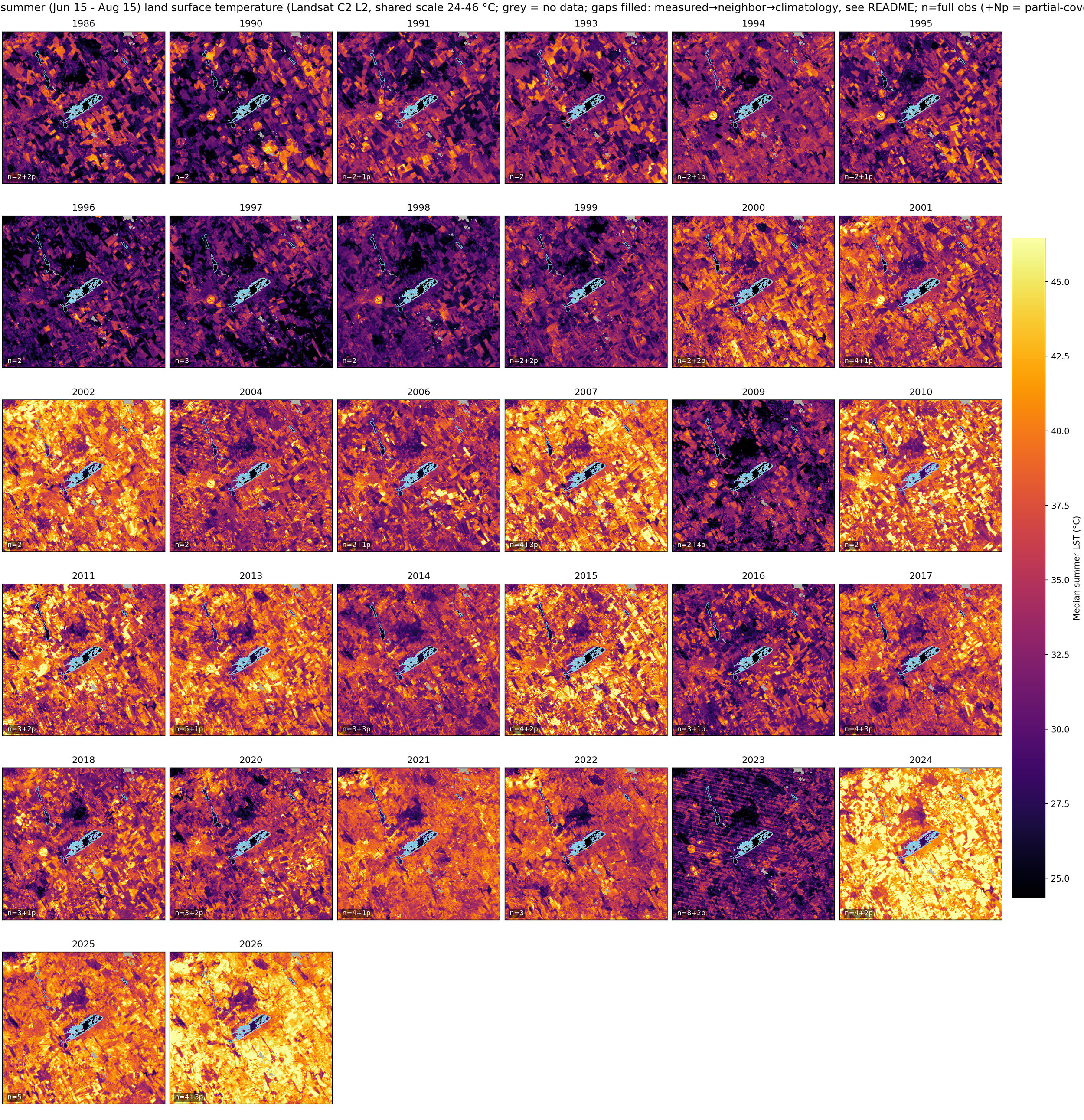
Figure 4b. Median summer land surface temperature of Velence, 1984–2026, 38 mappable years on one fixed 22–45 °C scale. Grey means no usable data. The label in each panel counts the observations behind it.
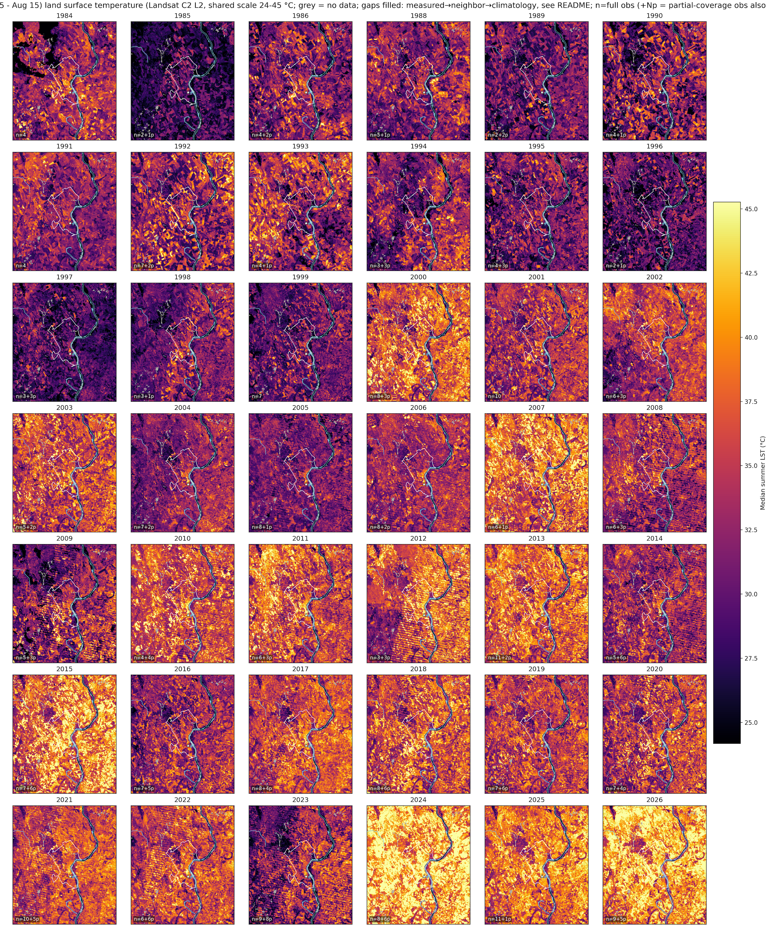
Figure 4c. Median summer land surface temperature of Paks, 1984–2026, 38 mappable years on one fixed 22–45 °C scale. Grey means no usable data. The label in each panel counts the observations behind it.
Five years are missing, and I left them missing. 1985 through 1988 simply have too few usable Landsat 5 scenes over Hungary, and 2012 falls in the window where Landsat 7's scan-line corrector had failed and Landsat 8 had not yet launched. Interpolating across them would have produced a prettier grid and a less honest one.
The interactive map
After collecting hundreds of satellite scenes, and then merging them into one high-resolution surface temperature scene per year (summer), now it was time to create this interactive map. Its simply more fun to explore - and also allows us to observe the data in more details. Its because a static grid answers "what did the summers look like?" It cannot answer "what does my street look like, and how has it changed?" So I put all of it — three study areas, every year, three levels of aggregation — into a single self-contained interactive map, on a dark basemap, with the whole thing driven by two sliders.
Figure 5. Four decades of Hungarian summer surface temperature in one map: three study areas, every year, three levels of aggregation, on a dark basemap.
Here is how to read it:
- The place selector switches between Budapest, Paks (the nuclear power plant of the country) and Lake Velence (a freshwater lake drying up as we speak). Each one re-frames the map and swaps in its own forty-year archive.
- The year slider runs across all 43 years. Years without enough cloud-free data say so instead of silently disappearing — a gap in the record is information, not an inconvenience to hide.
- The view selector changes what the temperature is painted onto: raw 30-metre pixels, OSM building footprints, or the OSM road network.
- The opacity slider fades the thermal layer against the basemap, which is how you find out what the hot patch actually is. The single most satisfying thing to do with this map is to park it on a blazing yellow blob, drag the opacity down, and watch a shopping-centre car park appear underneath.
- Each view also has a Δ mode, painting the difference between the 2020s and the 1990s instead of a single year.
The colour scale is fixed across every year and every place: 23 to 46 °C, inferno. Fixed scales are non-negotiable in this kind of visual — per-year autoscaling would make every summer look equally hot and destroy the entire comparison.
Three ways to map the same heat
The interactive version comes with three views, pixels buildings and roads, mapping the same satellitemeasurement hung on three different canvases, and telling somewhat different stories
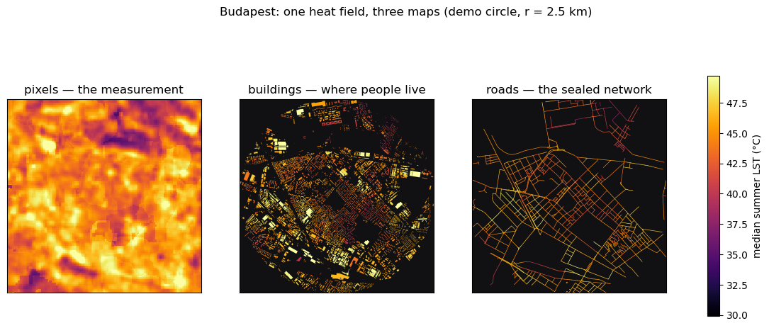
Figure 6. One heat field, three maps: raw pixels (the measurement), buildings (where people live), roads (the sealed network that drives the heat).
First, Pixels are the raw, original version — the measurement itself, showing the median values of the measured pixel-level surface temperature data.
In the second layer comes Buildings. To get there, I joined the satellite data, each and every pixel, onto 553,614 OpenStreetMap building footprints in Budapest, and the spread is stark: the hottest tenth of buildings sit in surroundings of 41.7 °C or above, the coolest tenth at 34.4 °C or below. A seven-degree gap, depending on which side of the river you sleep. Then repeated the same for the other two locations. The building-level mapping hints the possible exposure locals, living in those buildings, may have to endure.
Figure 7. Summer surface temperature 2020–2026, mapped onto every OSM building footprint in Budapest.
Third, Roads. Asphalt is dark, dry and heavy — it absorbs sunlight, holds the heat, and releases none of it as evaporation. Painting the network by how much it warmed since the 1990s shows the transport skeleton lighting up, showing areas where walking outside turned hotter in red - essentially, the whole city.
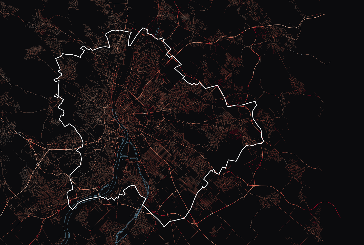
Figure 7. Warming along the Budapest road network, 2020s versus 1990s.
One shortcoming I have to state plainly, because it is the thing most likely to be misread: at Landsat's resolution these are not roof or asphalt temperatures. The thermal band is delivered at 30 m but its true resolution is around 100 m, while a typical building is 10–20 m across. Each building's value is the temperature of the ~100 m neighbourhood it sits in — roof plus street plus courtyard plus trees. Only the genuinely large buildings — 1,239 of them in Budapest, the industrial halls and panel-housing slabs that span multiple pixels — carry a value that is really about the building. The map is a legitimate cartographic transfer of neighbourhood heat onto a familiar canvas. It is not a thermometer on your roof.
What forty summers actually show
Three things stood out once the years were lined up next to each other.
The city's surfaces are simply warmer than they used to be. Inside Budapest, the median summer surface temperature averaged 32.7 °C across the 1990s and 38.6 °C across the 2020s — close to six degrees. In 2026 the city median reached 42.6 °C, and the hottest 5% of the city sat above 48.7 °C. Interestingly, the heat island itself hardly changed over the same period: the gap between the city and the countryside went from about +3.2 °C to +3.7 °C. The city warmed a great deal; its advantage over the surrounding farmland barely moved, because the countryside was warming too. It is a useful reminder that heat island intensity describes a difference between two places, and can stay flat while both of them get hotter.
The lakes are warming as well, not just the land around them. Lake Velence is the clearest case. Its own water surface reads about 23.5 °C in the early years of the record and about 26.5 °C in the recent ones — roughly three degrees warmer — while the farmland surrounding it warmed faster still, from around 32 °C to 36.6 °C. The lake therefore still stands out as a cool island, averaging about −9 °C against its surroundings, but the water underneath that comfortable-looking number is not what it was. For a lake this shallow — Velence averages little more than a metre — a few degrees is not a small thing, since warmer water evaporates faster and holds less oxygen.
The Danube at Paks tells a similar story. The river surface beside the power plant warmed from roughly 21 °C in the early record to about 25 °C recently, following the same upward path as everything else in the frame. That is worth noticing rather than dramatising: the plant draws Danube water for cooling, and the temperature of the river it draws from — and returns to — is a quantity that only moves in one direction across this archive.
What the map does not say
Some shortcomings worth carrying with every number above. This is morning heat — Landsat passes over around 9:30, so the afternoon peak and the night-time warmth that actually keeps people awake are not in here. It is clear-sky heat, since thermal sensors cannot see through cloud, which tilts everything toward sunny days. It is not air temperature, and not a measure of human heat exposure: surfaces run 10–20 degrees hotter than the air, and treating one as the other is a mistake worth avoiding. The heat island figure depends on which countryside you compare against — a wet forest makes it bigger, dry farmland almost erases it. And the maps are partly gap-filled, with every reconstructed pixel flagged in a companion mask; in 1984 that covers about half the frame. If you want the full picture of why land surface temperature is a genuinely contested quantity, that is what the review below is about.
Closing
What I find most interesting here is not the pictures. It is that the whole thing runs on free data, open tools, and a laptop: a public satellite archive going back four decades, an open catalogue API, OpenStreetMap for ground truth, and a few hundred lines of Python — no institutional access anywhere in the pipeline. Anyone reading this could point the same code at their own city tonight, since the notebook takes one variable to switch places. And the pattern generalises well beyond heat: take a physical measurement that arrives as an inconvenient grid of numbers, put it on a canvas people actually recognise — their street, their building, their neighbourhood — and be explicit about what it does and does not mean. The map only becomes useful when someone finds their own house on it. It stays honest only if the caveats travel with it.
